A Customer Experience Model and On-site Searching
In this post I’ll try to introduce a few of the tools I use when thinking about customers behavior and needs and how they apply to onsite searching (note I’m not discussing e.g google searches).
The importance of search as a complement to navigation are thoroughly researched, since early days of the internet (see e.g. http://www.useit.com/alertbox/20010513.html from 2001) I personally think the search function on a website is particularly interesting as customers intent are shown, and poor search can really frustrate users. A significant amount of websites have poor search, and few have great search. Given the importance I hope that will change.
One of the things at the center of my thinking when looking at websites or cross-channel sales processes is how well the online experience caters for the different modes or mindsets a customer/user can be in. Since I’ll come back to it more in later (intended) posts about channel strategies & tactics, I’ll quickly introduce a Customer Experience Model. If you think about the process of purchasing a product or a service, a number of natural steps occur. In a simple generic case it could look something like this:
- Pre-discovery
- Discovery
- Planning
- Order placement (*)
- Waiting for the product
- Getting the product
- Using the product
- Telling the world about the experience
Especially in the last few years, the final step has significantly influenced the top 3 through social media. Also in reality the process is not linear, and it often goes across channels with e.g. research online and purchase in store. The key message is that it can be used as a mental tool to think about users intent and therefore help to create a good experience that matches that intent. The key with search is that it shows that the customer has an intent – so what is that and how can we best meet it?
This is my position: you shouldn’t primarily have search to surface your cool content, deflect calls, or to cross- or upsell. You should have search to meet the users needs and intent and thereby creating a great customer experience. Let’s keep the thinking from the outside and in. The rest will follow if you design for the users.
So after this somewhat theoretical start lets check out a few examples of searches today. I picked the telco sector and decided to check out the big 4 in the Swedish market: Telia, Tre, Tele2 and Telenor, and then compare with Sprint which I think is doing a great job from a customer experience perspective.
I’m thinking that I am a user in the planning phase, I am fairly decided on a smartphone and interested in a Blackberry or iPhone and researching online. I intend to use it both for business and privately. Let’s explore how these different sites helps me progress the customer experience if I end up using their search.
Tre.se
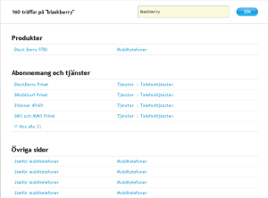
Click on the link for larger image. URL to try yourself is http://tre.se/Privat/Sok/?q=blackberry&qform=global
What I like about this is that it categorizes the results for me, with Products, post-paid offers & services and other pages. What I think is missing is information about prices, calls to action (why not a “buy” or “help me choose” in case of many products). For me as a potential customer this should be treated as the start of a sales funnel. Some room for improvement here I think.
Tele2.se
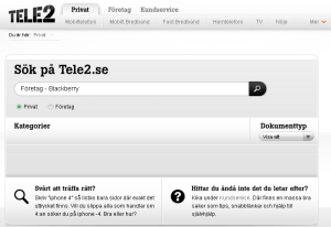
Click on the link for larger image, URL to try for yourself is http://www.tele2.se/sokresultat.html?page=&query=F%C3%B6retag+-+Blackberry&search=privat&doctype=0#
So the main problem I have here is that there is actually a nice drop down as I start to type blackberry that says that Företag – Blackberry is a valid search term. But I get zero results. If I choose Företag (company) I’ll get 1 result. But why (thinking as a user) do I have to choose that? I am sure there are tons of technical reasons with different content repositories, different organisations internally etc, but as a user I dont appreciate this approach as it a) doesnt support my intent to learn more so I can make a decision and b) it hands over internal issues on me as a user.
If you try the tele2 search for iPhone instead http://www.tele2.se/sokresultat.html?page=&query=iphone&search=privat&doctype=0#, you’ll get better results and you can use the categories to make sense of it. As a user I’m not overly impressed with this display and the experience, no images or overview. It is not helping me progress, I feel frustrated.
Telenor.se
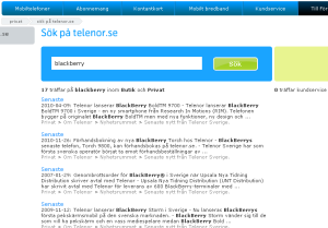
Click on the image for larger size, to try it yourself the URL is http://www.telenor.se/privat/sok.html?q=blackberry
There are several things here, the list is only results from their newsroom, comes in an irrelevant order and cant be filtered or sorted. It doesn’t recognize the string “blackberry” as a product. Why? Because apparently blackberry’s are only sold for corporate customers. In this case, Tele2s solution that makes me aware that there are differences between searching as a consumer or as a corporate customer is more clarifying. I got to this page from the main search box on the homepage – I have not indicated that I am a B2C customer, it is assumed by the system. The same search as a corporate customer is available here http://www.telenor.se/foretag/sok.html?x=0&y=0&q=blackberry and is better, although the listing is not managed.
On the other hand, if you look at the http://www.telenor.se/privat/sok.html?q=iPhone the search recognizes the string as a product and presents a listing including price indications and product images. Much better! I am now being taken through the start of a sales process.
Telia.se
Telia doesnt seem to sell blackberries so the search is for iPhone. Click for larger image, to try yourself the url is http://www.telia.se/privat/sok/sok.page?q=iphone
What I like here is that they have incorporated results from forum posts to the right that immediately drew my attention, great even though I’m in purchase mode I know I can go here for help later! What I don’t like is that the relevance of the list is not great, the top hit is linking to a headset. Why is that? An actual phone ends up on place 5. Again not an optimal customer experience for someone set out to buy a smartphone. So I tried to be even clearer, and asked the system “How much is an iPhone with a post-paid agreement”? (*evil grin*) URL: http://www.telia.se/privat/sok/sok.page?q=vad+kostar+en+iphone+med+abbonnemang%3F
Note that I intentionally misspelled abbonnemang. What happens is that HTC desire comes up, nothing about iPhones… Looking back at the Nielsen article referenced on top, these kind of misspellings needs to be handled better.
So lets check out what I believe is a really good example.
Sprint.com
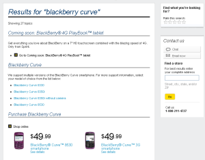
Click the image for larger size, or the URL to try yourself is http://search.sprint.com/inquiraapp/ui.jsp?question_box=blackberry+curve&ui_mode=question
As you can see from the URL they are using a product called InQuira. Quite impressive.
A number of things to note. I started with just writing “blackberry” – the system gave me a similar view but clearly helped me to qualify my search so I added Blackberry Curve. That made me feel good. There are several interesting features here.
- A promoted area up top – what is coming up
- Clear support links depending on model
- Very clear and ordered list of products, including prices with clear calls to actions (including a see more option to not clutter the experience and drown me in information)
- Below the fold are a good and clean answer section with videos
In short a mix of service and sales messages without overloading me. I can easily scan and find what is suitable to me. To the right are two key cross-channel functions.
- Click to chat & email support that connects me with customer service
- Find a store – so I can figure out where I can go and touch and feel the product
The importance of these two functions should not be underestimated especially for complex purchases where many customers want to have human interaction. Making it easy for users to connect the online experience with the retail and call center will keep the prospect from wandering in to the competitions stores on the lunch break to make the purchase, after researching the product on your site. 😉
Summary
As I’ve tried to show in this quite lengthy post, it is quite common that the search experience is not what it should be and definitely not what it could be. Getting it right is hard and there are many challenges, but there is also good examples to be inspired from out there. Most sites will rely on their navigation and users ending up in the search area are not likely to have a great customer experience. I’d say The telco industry is not special in this regard, try searching for e.g. bolån (home loans) on any of the major Swedish bank sites.
Comments? Thoughts? Let me know what you think about the importance of onsite search for a good customer experience, is it worth the hassle or is a great navigation enough…?
(*) Traditionally most websites emerging from the “low cost of acquisition channel” thinking are focusing on the planning and order placement steps too much which I’ll probably get back to in future posts


Very nice work. I seriously enjoyed A Customer Experience Model and On-site
Searching | Most things digital. I trust you don’t mind me expressing this but it brought to mind harold that I read about on an alternative site.